Part 08. Data exploration
This page is primarily about use of R Commander and local installation of R. However, there are also instructions about R packages that apply to users of R in Google CoLab.
Learning objectives
- Conduct basic data exploration to understand data structure and detect issues.
- Visualize variable distributions and relationships using R.
- Use R Commander’s menus and script window for exploratory analysis.
What to do
Complete the exercises on this page. The goal is to find out which method for data entry you prefer. Hint: importing data from a spreadsheet is a good choice!
- Basics of data exploration
- Look at the data
- Summary statistics
- Problems to try
- Additional data exploration
- Quiz
How to do it
For these exercises, you may work
- within the Rcmdr script window.
- at the command line and R prompt.
- from a script document and the R GUI app.
- RStudio.
- Google CoLab or other cloud service.
Choose one way. If you’re working with R on your computer, then the quickest way is to just work with R Commander. or create a new script document to run in the R app. If you are working with Google CoLab, the instructions presented here apply with minimal changes required. Exceptions are marked with CoLab, skip this step statement.
Let’s begin.
1. Load a data set that interests you
To begin, we need a data set. If you have one you have created — good, loading that kind of dataset was described in Part 07. Working with your own data. If you do not yet have a dataset, then R comes with about one hundred datasets (base), to several hundred depending on the other loaded R packages. How to work with built-in datasets was the subject of Part 06. Work with an included dataset. We’ll just briefly review.
Submit the following code in R to get a listing of available data sets, along with a brief
2. Basics of data exploration
Work on this page is described in detail in Chapter 3 Exploring data and Chapter 4 How to report statistics of Mike’s Biostatistics Book. Here, we note that
- looking at your data (scanning the data frame, making simple plots, checking for missing values) and
- producing basic descriptive or summary statistics (where’s the middle of the data — the average or median; how spread out from the middle are the data — the standard deviation, the range)
Steps one and two are necessary steps before proceeding with statistical inference, ie, the testing of hypotheses. The purpose of data exploration phase is to identify characteristics of the data, but also to identify if there are problems with the data set.
BI311 students with a local installed R environment, we recommend use of R Commander. While one can work on the problems described on this page on the R command line, or other scripting environment besides R Commander, the advantage to work with R Commander is that many of the commands we need are accessible via a simple drop down menu system. This approach allows beginning statistics students to focus on the data processing steps rather than the code required to accomplish the steps. We do include the R code needed to run the commands without R Commander; R Commander, as teaching software, responds after menu selections by printing the code, which we then can modify as needed. Thus, Google CoLab users may read through the material, look for
2. Look at the data
After starting R Commander, load an installed data set.
With the base
For this example I will load the airquality dataset included in the datasets package. First, look at the data. Use histograms for each variable (Ozone, Solar.R, Wind, Temp) to get a sense of the spread of the data. In R Commander access histograms and other basic graphs via the menu Rcmdr: Graphs → Histograms … , which brings up a two-tabbed menu. The first tab allows us to select the variable to plot.
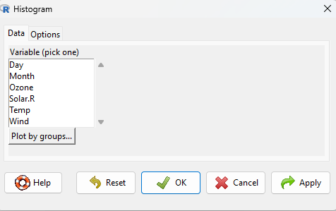
Histograms for Day and Month don’t make sense, but the other variables seem like candidates. Select Ozone, then click on the Options tab and choose the graph settings — for now, accept the defaults.
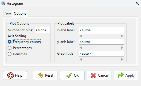
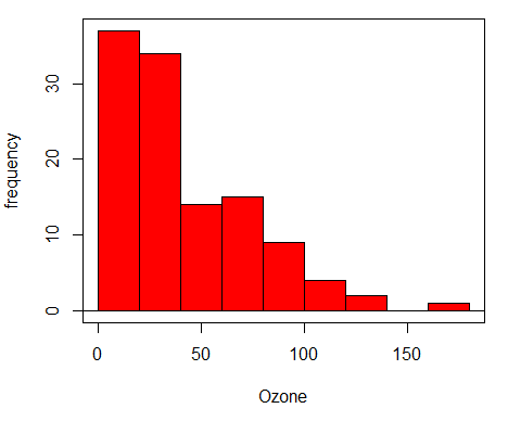
In Chapter 4 How to report statistics of Mike’s Biostatistics Book we explore histograms a bit more. Click OK to proceed and view the plot. The default graph produces gray bars — we can do better. Find the following code in the R Script window
with(airquality, Hist(Ozone, scale="frequency", breaks="Sturges", col="darkgray"))
and change darkgray to red, then with the cursor placed anywhere on the line of code, press Submit button. The resulting graph looks like
Next, as part of data exploration we should see how variables tend to relate to each other. We try scatterplots, aka x-y plots (again, we cover this in Chapter 4 How to report statistics of Mike’s Biostatistics Book).
In R Commander access scatterplots via the menu Rcmdr: Graphs → Scatterplot … , which brings up a two-tabbed menu. The first tab allows us to select the variables to plot, the x-variable (horizontal axis) and the y-variable (vertical axis).

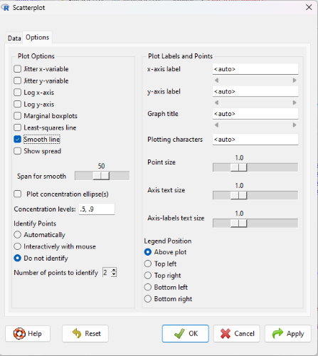
Scatterplots with time (Day, Month) on the horizontal are a special type of scatterplot called time series plots. Thus, unlike the histogram, all of variables seem like candidates. Select Day (x-variable) and Ozone (y-variable), then click on the Options tab and choose the graph settings — check the box next to Smooth line (lowess smoothing algorithm) and accept the defaults for the other options.
The resulting graph is shown below

I’m happy with the blue, but to be consistent with the histogram, change the points and line color to red. Find the following code in the R Script window
scatterplot(Ozone~Day, regLine=FALSE, smooth=list(span=0.5, spread=FALSE), boxplots=FALSE, data=airquality)
and insert col="red" between boxplots=FALSE and data=airquality. With the cursor placed anywhere on the line of code, press Submit button to make the new plot.
3. Summary statistics
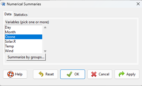
Descriptive statistics serve the purpose to reduce lots of data (numbers) into a few numbers that can tell us something about the middle and the spread or variability of the data set. For the airquality data set, for example, we want to know what was the average ozone level observed? What was the range (maximum value minus the minimum value) of ozone levels? And so on. R Commander provides access to a number of descriptive statistics via the summary table command. Rcmdr: Statistics → Summaries → Numerical summaries … brings up a menu with two tabs. In Data tab, select one or more variables (here, we selected just one, Ozone), then click on Statistics tab.
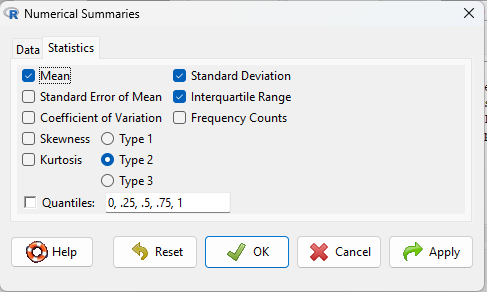
From the statistics tab select descriptive statistics to describe the middle (Mean) and the spread or dispersion of the data (Standard Deviation and Interquartile range),
Select OK to submit. Resulting output shown below
    mean       sd   IQR   n NA
42.12931 32.98788 45.25 116 37
Thus, the average plus or minus the standard deviation for ozone levels was 42.1 ± 32.99 parts per billion
Before trying the problems, take the simple quiz to review some of the topics presented in this page.
4. Problems to try
1. Choose a data set from the “datasets” package. There are more than 70 different data sets, choose airquality and one from the list below plus one additional data set that interests you that is not included in this list (for help, see Part 06. Work with an included dataset), for a total of three datasets. Use the Help on selected data set for more information about the data in each data set. Not all of the data sets in “datasets” will be appropriate to work with in this exercise — try different data set if you run into trouble.
- airquality (should explore and confirm the work presented here)
- BOD
- CO2
- Chickweight
- DNase
- Formaldehyde
- HairEyeColor
Identify the variables and data types for your three datasets. For example, the dataset “airquality” has six variables, Ozone, Solar.R, Wind, Temp, Month, Day, with Month and Day factor variables (nominal data type), and the other variables ratio scale.
2. Check for missing variables in your dataset. For example, I looked at “airquality” and found, via the command sum(is.na(Ozone)), 37 missing entries for the variable Ozone. Knowing missing values are present is important because many of the functions assume no missing values for their calculation. For example, if we write the command for mean()at the R command line, then we have to modify the function by adding na.rm = TRUE to handle missing values (happily, R Commander will handle missing values for us!). R Commander also provides us a way to count missing values via the menu. Rcmdr: Summaries
3. For each of the data sets you selected, generate descriptive statistics (mean, median, standard deviation, range, coefficient of variation) for the ratio scale variables. Generate a summary table to display these statistics. Functions include
mean(),median(),sd(),range()- there is no built in function for coefficient of variation function included in R, so you’ll have to write your own
- From Rcmdr you have
- Statistics → Summaries → Active data set and
- Statistics → Summaries → Numerical summaries
4. Generate appropriate graphs (scatterplot, histogram, bar chart, box plot) for variables in the data set.
Hints: R needs to be told how to recognize variables in data sets. There are two ways to refer to variables in data sets.
5. Point to the variable name in your command. For example, if you are going to get the mean of variable “maleAge” in the data set “birds“, then you would write
mean(birds$maleAge)
Thus instead of writing “variable” name by itself you have to either remember to write “dataset$variable“, e.g., birds$maleAge as above.
6. Option 1 works fine if you are only working with a couple of variables, or just a few commands. To simplify this process you can attach the database in R. For our example, then, we have
attach(birds) #this attaches the database to the current R session mean (maleAge)
Attaching datasets makes the variable names directly available and all you then do is write the variable names. For our example, then, we would write, maleAge directly to work with the variable.
5. Additional data exploration
In R Commander, try commands available to help you learn and visualize variables in the dataset
- Get Summary statistics
- Statistics → Summaries → Table of statistics (try different combinations!)
- Make a Histogram for one variable (applies to ratio scale variables)
- Graphs → Histogram…
- Make a Scatterplot between two variables (ratio scale)
- Graphs → Scatterplot…
6. Page quiz
Data exploration
Six questions from this page